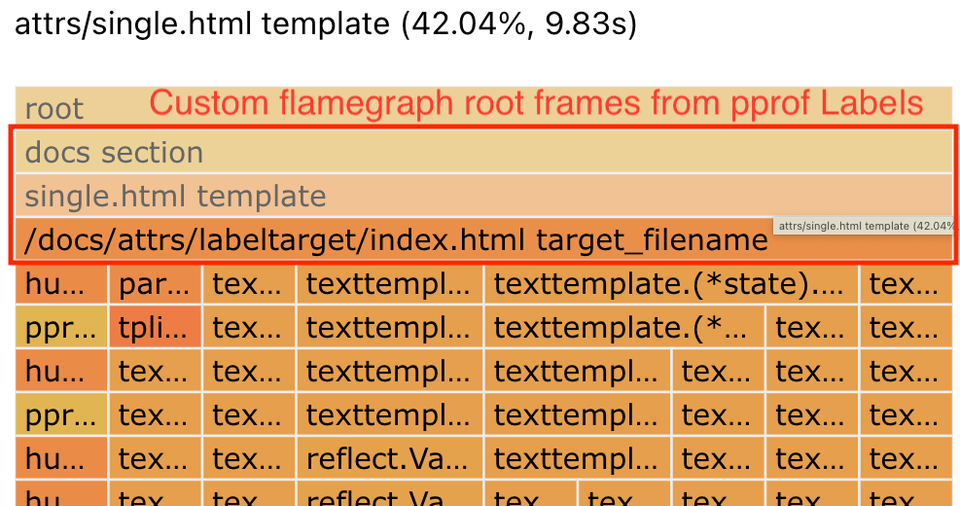
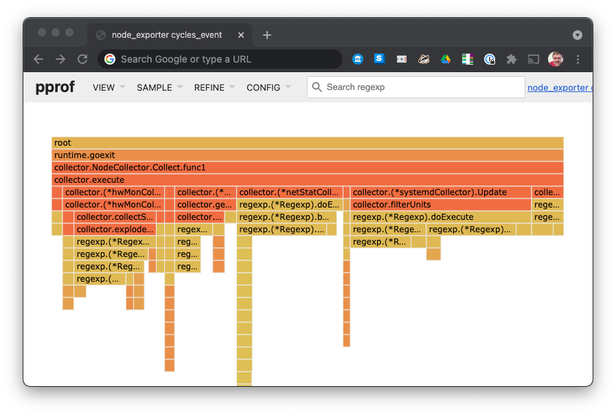
pprof -tagroot lets you break down & visualise pprof software profiles by custom, domain-specific key-value pairs (Labels, aka Tags) attached to each stack sample.
This post covers: Adding colours to Firefox Profiler, and some neat tricks I
learned along the way: data-oriented-programming in JavaScript, data format
upgrade pipelines, and developer experience in test runners and
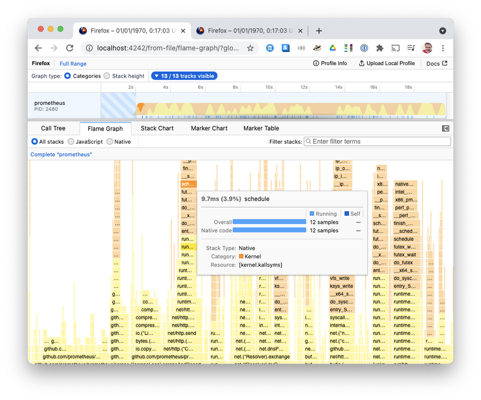
This post is a quick literature review of CPU profiler user interfaces available
for analysing Linux program performance.
I couldn't find any list of profiler UIs online. Hopefully this can help
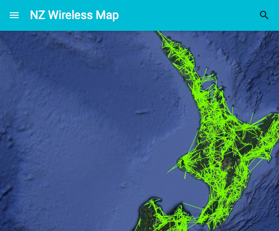
Almost a year ago, I promised a post detailing how I process NZ Wireless Map's
data to keep it fresh [https://www.markhansen.co.nz/automating-nz-wireless-map/]. Here it