A New Map of New Zealand's Wireless Networks
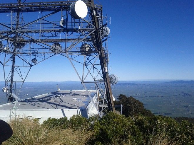
Mt Te Aroha Antenna Mast (Photo Credit: Joel Oughton)
I've just launched a new visualisation: a map of New Zealand's terrestrial Radio/Wireless network.
It's a map that draws lines showing the links between antennae like the one shown at the right. You might have seen these towers on top of hills while driving. I always wondered what they were used for, and where they connected to. Now you can see where the links go, and who they're for!
It's not just huge antenna mast towers like the one shown above. Hospitals, big businesses, cell towers, weather stations, and offshore oil rigs are connected with these radio links.
I'm really excited about being able to visualise this data - the map shows over 17,000 locations, and 26,000 point-to-point links over the whole country!
Here's the visualisation: NZ Wireless Map. Check it out!
Here's just a few interesting things I found exploring the data:
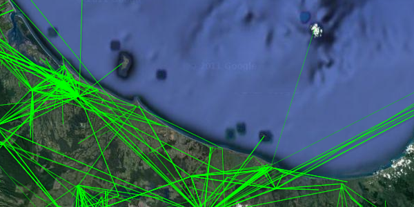
Lake Rotorua
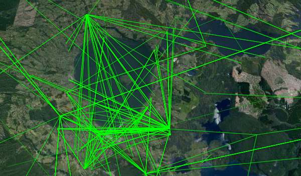
Lakes are awesome to transmit across! They stay flat, and usually have good hills on either side. Lake Rotorua demonstates this really well - here you can see how densely it's criscrossed with links.
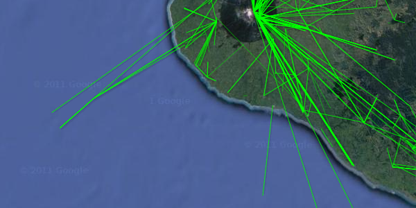
Auckland Skytower
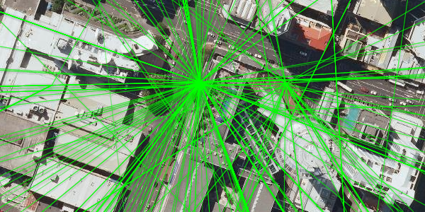
The busiest place I could find, with the most links converging on one location, was the Skytower in Auckland. Here dozens, if not hundreds of wireless links converge from all over the Auckland region.
Hamilton
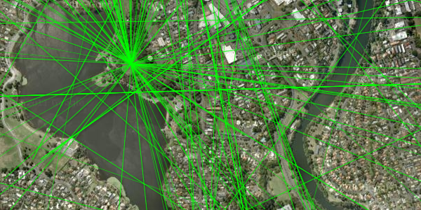
Hamilton's a very flat city, and there's not much in the way of mountain ranges nearby. I imagine this would make it difficult to transmit signals to the roofs of buildings in town. On the map, you can see how transmitting companies have dealt with this flatness - the few high buildings that do exist are used extensively:
- The Hamilton Lake Water Tower (shown)
- Waikato Hospital
- WEL Building
Signals spread all over town from these vantage points.
Taranaki Oil/Gas fields
You don't usually notice New Zealand's offshore gasfields on maps, but they really stick out on a map of wireless links. You can see the Maui A and Maui B platforms communicating through a host of links on the Taranaki shore, and the Kupe Gas field south of the mountain.
White Island
We even have a wireless link set up to an active volcano. Awesome!
Views
Exploring the map, I realised that it inadvertently highlights the best views in the country. Antenna masts are specifically placed for great views in all directions. Lots of research must go into finding the places with these great views before spending vast amounts of money erecting a tower.
Why not take advantage of all this research into great views next time you're deciding where to go hiking?
Getting the data on the map
If you've got a nerdy streak, keep reading. This is where I explain the programming behind the visualisation. It's all open source, available on Github.
A friend showed me BarTender's work making maps of cell tower sites he made using Radio Spectrum Management's database. BarTender explains how he extracted the data from the Microsoft Access Database dump, into a SQLite database with mdb-sqlite, then used SQL queries and XML tools to manipulate the data into KML files.
I managed to dump the SQL out of the Access Database and import it into SQLite using these instructions. Then the data was all mine to mess around with!
Exploring The Database
I found the important tables (here's the full schema):
-
Licence: A licence to use the airways granted to a company. Usually
this has one or more ReceiveConfigurations and TransmitConfigurations. -
ReceiveConfiguration and TransmitConfiguration. These tables give information on locations, antenna equipment, direction, and height.
-
Location: This table gives each location a name, height. However, you need to join with GeographicReference to get Latitudes and Longitudes.
-
GeographicReference: NZ uses a whole lot of geodetic datums, and this table holds the location of each antenna in every different format. We're only interested in WGS84, the worldwide format that Google Maps uses. This table will give us the Latitude and Longitude of each location.
I crafted an SQL query to select pairs of towers, but it was incredibly slow. I put a few indexes on ID fields of the tables I used, and then the query ran in less than a second. Awesome.
Plotting the lines
I wrote a python script to manipulate these transmit-receive antenna pairs into KML, showing the pairs as lines on a map. I hadn't used KML before, but, aside from being XML, it was very easy. The format is well documented, the only problems came when one of the names had an 0x19 "ASCII device control 3" character, which XML apparently can't represent. I removed the character, and everything worked swimmingly.
However, the network was far too crowded with fake links, with far too many links going out into the middle of the sea. Upon investigation, these links were all the corners of a "Receive Protection Area" polygon - not an actual point-to-point link. I had to reverse engineer the database to figure out that point-to-point links are identified by locationtypeid = 4, and then the map showed the real structure of the network.
Huge lines were also stretching up to the equator, stretching out to geosynchronous satellites. These lines were really interesting, but they obfuscated the terrestrial links, so I removed the satellite links. I'd like to add them back in somehow, maybe by using another marker on the ground where the uplinks are.
Putting it on a website
This was all great, but I can't expect people to download a KML file and open it in a desktop application. People expect data to be available in a web-based tool these days, and if it isn't, many people just won't bother.
First of all, I tried hosting the KML on a server, and searching for the URL inside google maps, just like BarTender has done with his cellphone maps (here's an example). However, Google Maps has specific limits on the number of features it will plot: 1000 data points, and 10MB of KML. I had over ten thousand features, and 20MB of KML. This wasn't going to work.
Fusion Tables
There's a way around this, by using Google Fusion Tables. Fusion Tables is one of my favourite tools for visualisation.
Fusion Tables is like a spreadsheet program, but with specific support for geographic data types: placemarks, routes, polygons. It comes with a half-dozen visualisation methods, including "Map" view, where it can plot KML on a map. With Fusion Tables, there's no limit to the amount of points you can plot on the map. Perfect!
I repurposed my KML exporter into a TSV exporter, and uploaded the data to Fusion Tables. You can then specify what information you want in the popup when a user clicks on a line - I made it show the receiver, transmitter, licence id, and licencee. and made the lines a bit thinner and greener.
Fusion Tables makes it easy to make interactive geographic visualisations. I'm a huge fan.
Thanks
Many thanks to the people at Radio Spectrum Management in the Ministry of Economic Development. They've made public a very high-quality dataset containing all the radio licences in New Zealand. Usually when dealing with datasets with tens of thousands of points, there's a few problems, but this dataset is pristine. This wouldn't have been possible without their hard work. Cheers!
Have a look, go exploring, and let me know in the blog comments if you find something interesting. Feedback is much appreciated!


Comments ()